
Butter Yellow Kitchen Cabinet Ideas That Feel Fresh, Not Dated
Butter yellow kitchen cabinets are back in a big way — and this time, the shade is softer, creamier, and far easier to live with than the lemony yellows of decades past. If you’re drawn to a kitchen that feels sunny and welcoming without screaming for attention, butter yellow delivers: it reflects light beautifully, pairs with nearly every wood tone, and sits comfortably between classic and current.
The trick is execution. Butter yellow can read as charming cottage or dated fast-food depending on the undertones you choose and what you pair it with. Below are 12 butter yellow kitchen cabinet ideas that keep the color feeling fresh, grounded, and intentional — from full-commitment kitchens to low-risk ways to test the waters.
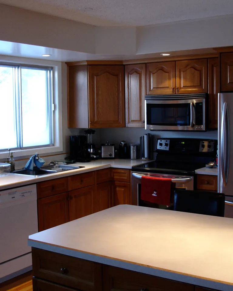
1. Ground Butter Yellow with Warm White Walls
The single fastest way to make butter yellow cabinets feel current is to surround them with warm white walls instead of cool or stark whites. A warm white — think creamy, linen-toned, never blue-white — picks up the yellow’s golden undertones and makes the whole room glow softly rather than contrast sharply.
Why it works: Cool whites fight yellow’s warmth and can make it look dingy or accidental. Warm whites share the same undertone family, so the cabinetry looks deliberate and the kitchen feels sunlit even on gray days.
Tip: Paint a large poster board with your shortlisted wall color and prop it against the yellow for a full day. Yellows shift dramatically between morning and evening light, and this cheap test saves you from repainting an entire kitchen.
2. Go Two-Tone: Yellow Lowers, White Uppers
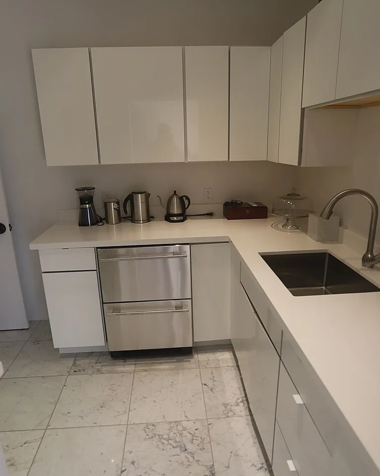
If full yellow cabinetry feels like a leap, split the difference. Butter yellow on the lower cabinets anchors the room with warmth, while white or warm-white uppers keep sightlines light and airy. The color division adds architectural interest even to a plain galley kitchen.
Why it works: Two-tone cabinetry is a established design move, so the yellow reads as a confident choice rather than a gamble. The white uppers prevent the room from feeling heavy, which matters in kitchens with limited natural light.
Tip: Keep the sheen identical on both colors (both satin, for example). Matching sheens make two-tone kitchens look planned; mismatched sheens make them look like a repair job.
3. Test the Color on the Island First
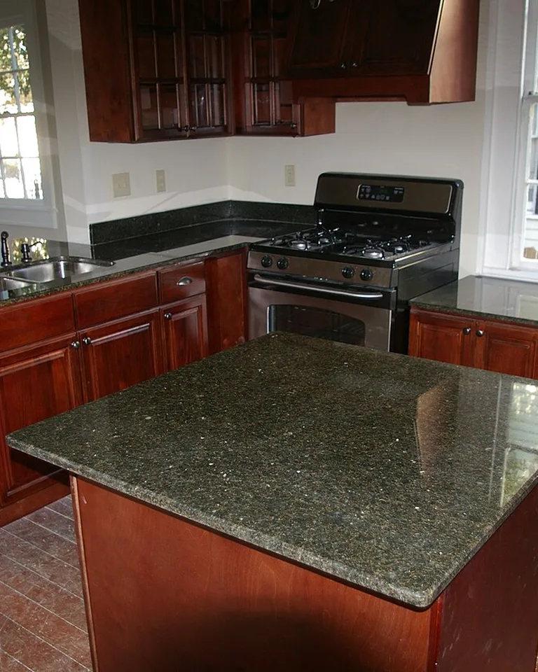
Love the idea of yellow but nervous about committing? Paint just the island butter yellow and keep the perimeter cabinets neutral. An island is one contained piece — if you tire of the color in five years, repainting it is a weekend project, not a full renovation.
Why it works: The island is naturally the focal point of the kitchen, so it carries a bold color without overwhelming. It also photographs as a deliberate design statement, which is why designers use this trick to add personality to otherwise neutral kitchens. For more ways to make a small footprint work harder, see these one-wall kitchen ideas.
Tip: Choose a slightly deeper butter yellow for an island than you would for full cabinetry — the smaller surface can handle more saturation, and the contrast against neutral perimeter cabinets is what makes it pop.
4. Choose Shaker Doors for a Timeless Foundation
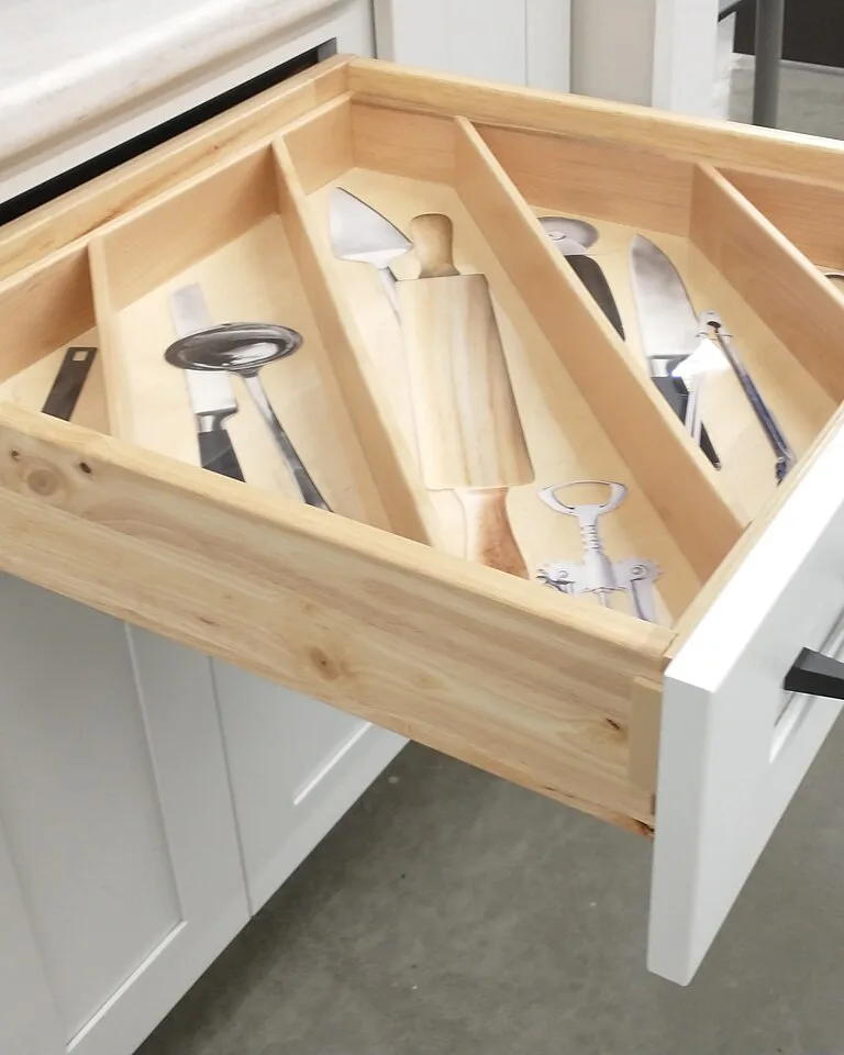
Butter yellow on shaker-style doors is the safest, most enduring combination in this color family. Shaker’s simple recessed panels have survived every trend cycle for a century, and they give cheerful colors the quiet structure that keeps them from feeling flimsy or trendy.
Why it works: Ornate door styles plus a playful color can tip into theme-park territory; ultra-modern slab doors plus yellow can feel like a retro diner. Shaker sits in the middle — classic enough to ground the color, simple enough to let it breathe.
Tip: If your existing cabinets are already shaker, you’re halfway there — a professional cabinet paint job on existing shaker boxes is one of the highest-impact budget kitchen remodel ideas you can do.
5. Add Unlacquered Brass Hardware, Sparingly
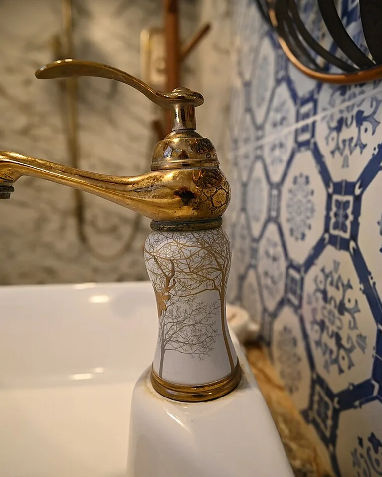
Butter yellow and brass are a natural pairing — both live in the warm end of the spectrum. Unlacquered brass goes a step further: it develops a soft patina over time, adding depth that polished finishes can’t match.
Why it works: The golden tones in brass echo the yellow without matching it exactly, creating warmth-on-warmth that feels collected rather than decorated. Used sparingly — knobs and pulls only — it elevates the cabinets instead of competing with them.
Tip: Skip chrome and brushed nickel here. Cool metals clash with butter yellow’s warmth and can make the cabinets look like they’re trying to be two different kitchens at once.

6. Pair with Creamy Marble or Quartz Countertops
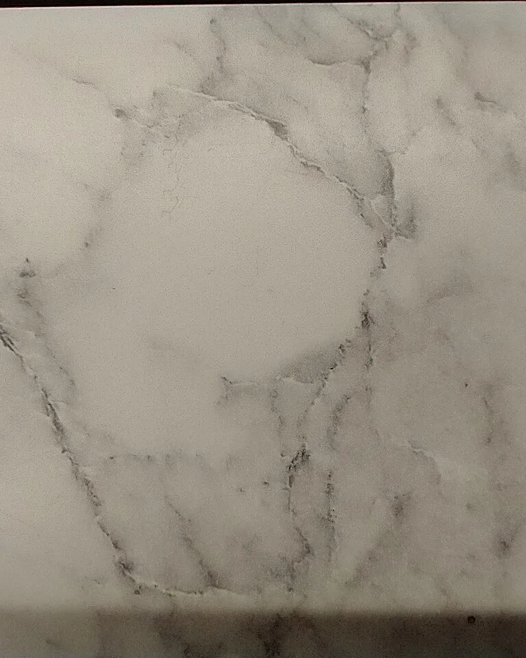
A creamy white countertop with soft veining — marble-look quartz or honed marble — keeps butter yellow cabinets from feeling flat. The subtle pattern in the stone gives the eye somewhere to rest between the wall of yellow and the backsplash.
Why it works: Butter yellow is a low-contrast color, and low-contrast needs texture to stay interesting. Veined stone adds movement without introducing a competing hue, and the cream tones bridge the yellow to white walls and ceilings.
Tip: If real marble’s maintenance worries you, quartz with a warm (not gray) veining pattern gives the same visual softness and wipes clean. For more on keeping white surfaces feeling warm rather than sterile, see these white kitchen ideas.
7. Let Natural Oak Be the Quiet Contrast
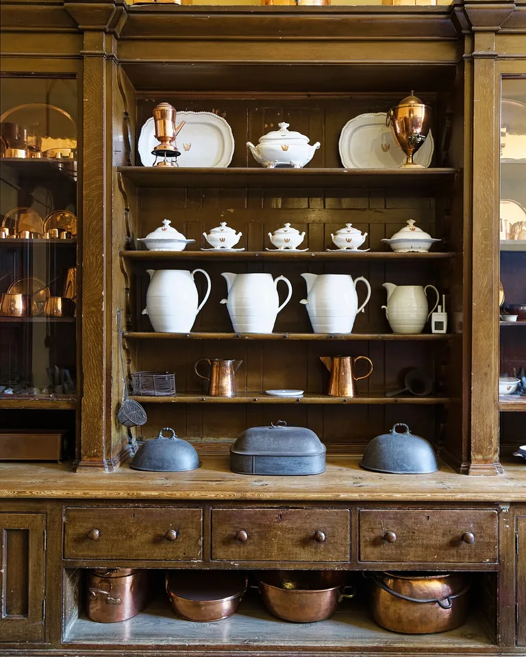
Natural oak — open shelves, a butcher-block counter, or a wood range hood — is butter yellow’s best friend. The golden notes in oak echo the yellow’s sunny quality while the wood grain adds the texture that painted cabinets lack.
Why it works: Painted yellow plus painted everything else can feel one-dimensional. One honest natural material breaks that up, and oak’s warm undertones keep the palette tonally consistent instead of introducing a jarring contrast.
Tip: Keep the wood finish light to medium. Very dark walnut next to butter yellow creates a high-contrast look that’s handsome but much harder to balance — save that pairing for when you want drama.
8. Layer in Soft Sage Green Accents
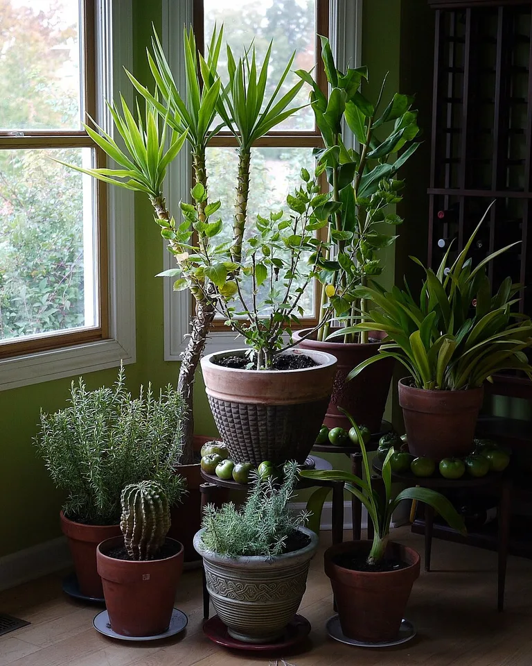
Soft yellow and soft sage are historical partners — think vintage kitchens and garden rooms. A few sage accents (bar stools, a tiled backsplash, open-shelf dishware, or even just potted herbs on the windowsill) ground the yellow with an earthy, natural counterweight.
Why it works: Yellow and green sit next to each other in nature, so the combination reads as fresh rather than forced. The key is keeping both shades muted — butter, not lemon; sage, not lime.
Tip: Start with plants. A few leafy herbs or a trailing pothos cost almost nothing and let you test the yellow-green relationship before committing to painted stools or tile.
9. Make the Pantry Wall the Statement Zone
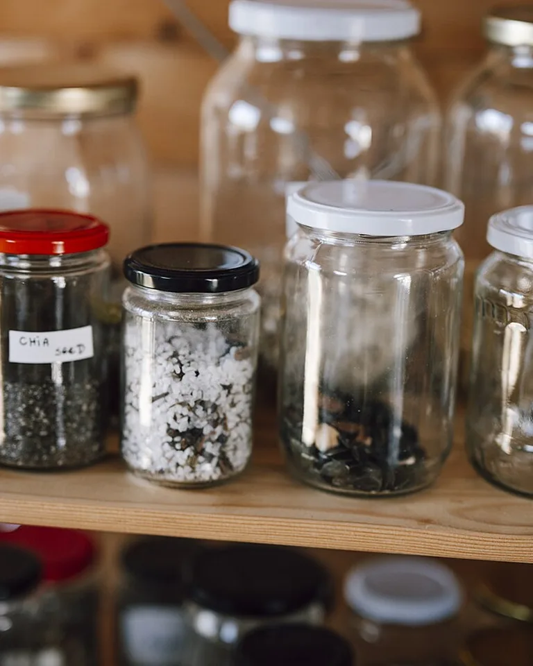
Not ready for a full yellow kitchen? Paint one section — the pantry wall, a hutch, or a built-in coffee station — butter yellow and keep everything else neutral. One saturated zone delivers most of the personality with a fraction of the commitment.
Why it works: Concentrated color in a single zone reads as intentional design, while the same color spread thin across a whole kitchen can feel indecisive. A yellow pantry wall also frames the prettiest part of many kitchens (the organized shelves and glassware) like a picture frame.
Tip: This is the ideal renter-adjacent move for homeowners: one wall of cabinetry is cheap to repaint if your taste changes, and it gives you real data on whether you want more yellow before going bigger.
10. Try Flat-Panel Doors for a Modern Take
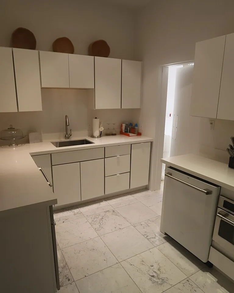
Butter yellow isn’t only for cottage kitchens. On flat-panel, handleless (or slim-bar-pull) doors, the same color reads crisp and contemporary — closer to a Scandinavian apartment than a farmhouse.
Why it works: The modern door profile strips away nostalgia, so the yellow is read as a confident color choice rather than a vintage reference. Pair with a simple white backsplash and minimal hardware to keep the look clean.
Tip: On flat panels, finish matters more — a matte or eggshell finish looks sophisticated; high gloss on yellow can veer into retro-diner territory unless that’s exactly what you’re after.
11. Add Matte Black Accents for Contrast
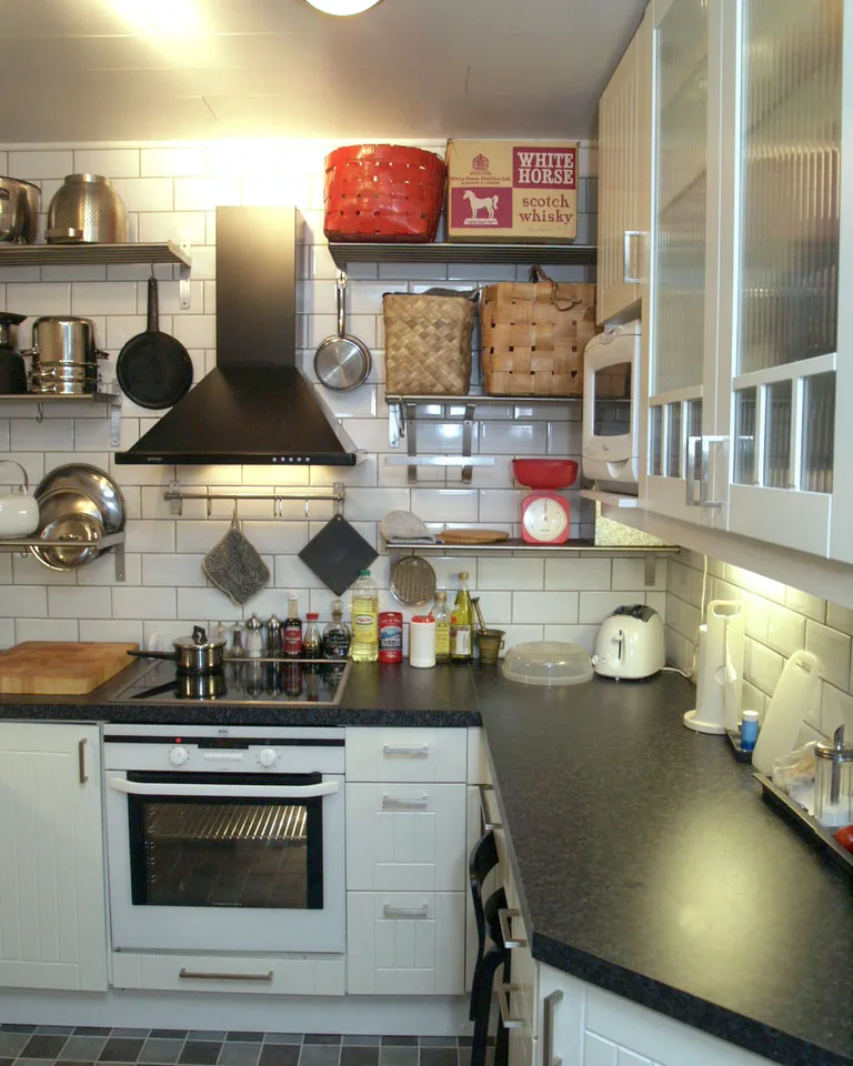
A little black goes a long way with butter yellow: matte black bar pulls, a black faucet, black-framed windows, or even a black range. The dark accents give the soft yellow something to push against, sharpening the whole kitchen.
Why it works: All-warm palettes can feel sleepy. Black adds definition and a contemporary edge without introducing a new color family, so the yellow stays the star while the black does the structural work.
Tip: Distribute the black in at least three spots (hardware, faucet, light fixture, for example). One lone black element looks like an accident; three looks like a scheme.
12. Style It Cottage with Open Shelving
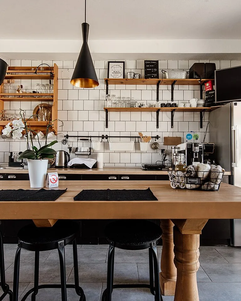
For the full cozy-cottage version, replace a run of upper cabinets with open wooden shelves. Style them with white ceramic dishware, woven baskets, and a trailing plant — the white dishes against butter yellow is one of the prettiest, simplest combinations in kitchen design.
Why it works: Open shelving breaks up the wall of yellow, adds the wood texture the palette craves, and puts everyday items within reach. It also makes a small kitchen feel larger, since your eye travels past the shelf instead of stopping at a cabinet face. If you’re working the dining corner too, these breakfast nook upgrades pair beautifully with a cottage-style kitchen.
Tip: Keep open shelves edited — everyday dishes and a few pretty pieces, not the full appliance graveyard. Cluttered open shelving next to a strong cabinet color doubles the visual noise.
Frequently Asked Questions
What colors go with buttery yellow kitchen cabinets?
Buttery yellow pairs beautifully with warm whites, soft creams, and light warm grays for a calm, cohesive look, or with natural oak and wood tones for added warmth. For contrast, muted sage green, deep navy, or matte black accents add sophistication without overwhelming the cheerful yellow. Avoid cool chrome or stark blue-whites, which clash with yellow’s warmth.
Are yellow kitchens considered trendy in 2026?
Yes — buttery yellow kitchens are enjoying a genuine resurgence, moving away from the harsh bright yellows of the past toward softer, creamier tones that blend modern style with cozy charm. Designers treat butter yellow as a warm neutral now, which is why it keeps showing up in both traditional and contemporary kitchen portfolios.
How do I make a yellow kitchen feel cozy and inviting?
Layer in natural wood (open shelves, butcher block, oak accents), soft textiles like a washable runner, and warm-toned lighting around 2700K–3000K. Ceramic pieces and fresh greenery add life, while creamy whites on walls and ceilings soften the yellow’s vibrancy into a warm, welcoming glow.
The Takeaway
Planning a bigger refresh? These open-concept kitchen upgrades show how to tie a new cabinet color into the whole main floor. Butter yellow kitchen cabinets work when the color is treated as a warm neutral rather than a novelty: pick a shade with soft undertones, surround it with warm whites and natural wood, and choose hardware and countertops from the same warm family. Start small — an island, a pantry wall — if you’re unsure, and let the color prove itself. Done right, it’s the rare trend that feels both current and like it’s always belonged in your kitchen.