
Studio Bedroom Design Ideas for a Cohesive, Intentional Look
A studio bedroom feels designed, not just decorated, when every zone in the room follows the same plan: one palette, one set of materials, one lighting logic, and clear boundaries that do not need walls. Decorating adds pretty things to a room. Designing decides where each activity lives, what the eye notices first, and how the whole space reads as one home. The ten ideas below work as a system — pick the palette first, then let each later choice repeat it — so a bed, a sofa, a desk, and a dining spot stop competing and start looking like they belong together.
Before you move a single piece of furniture, walk the room and name its zones: sleep, lounge, work, and eat. Most studios only need three or four, and each one earns its place by having a job, a light source, and a boundary you can see. That is the whole test for everything that follows. If a new purchase does not serve a zone or repeat the room’s palette, it will blur the plan rather than sharpen it. The same discipline that makes small apartment decorating work — fewer, better-chosen pieces — matters even more when the bedroom shares the room.
1. Pick a Three-Color Palette and Repeat It in Every Zone
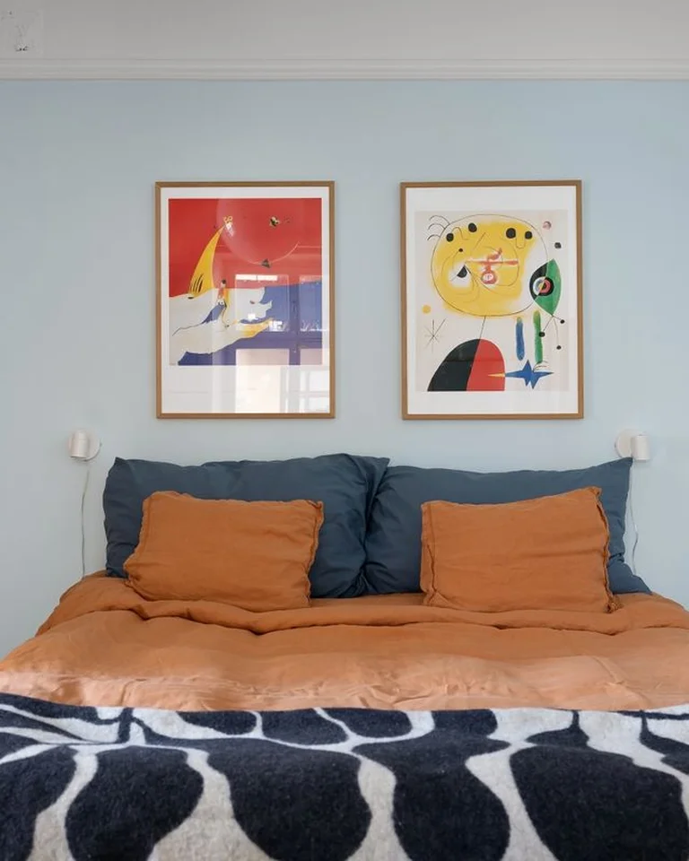
Choose three colors — one neutral base, one warm or cool secondary, and one accent — and use them in every zone. The bed gets the base and secondary, the sofa gets the base and accent, and the desk area gets a small dose of the accent. Nothing in the room should introduce a fourth loud color, because a fourth color is usually what makes a studio look like a collection of separate purchases. Paint is not required: bedding, throws, cushions, art, and a rug can carry the whole palette. The payoff is immediate. When the eye meets the same colors near the bed and across the room, the brain reads one intentional space instead of four unrelated corners. Keep the strongest color off the largest surfaces; let it appear in cushions, a throw, and one piece of art so the room stays calm.
2. Design the Bed Wall as One Composed Focal Point
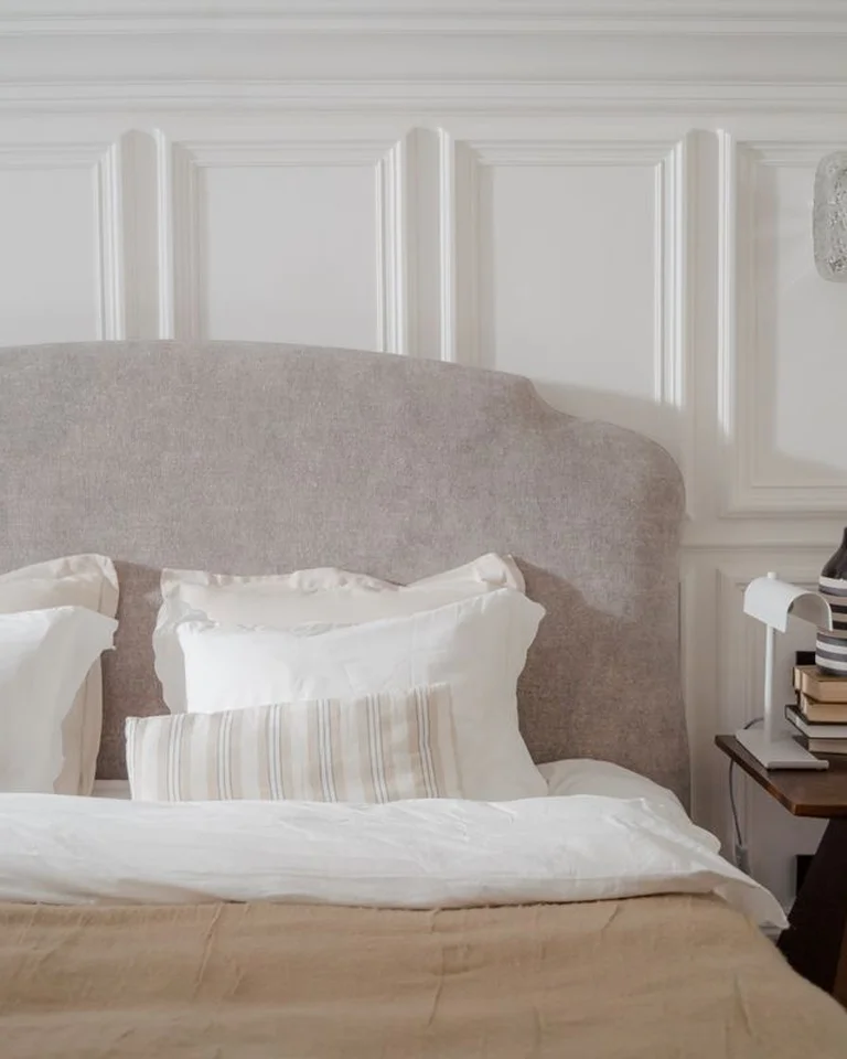
A studio bedroom has no door to close, so the bed wall is always on display — treat it like a composition, not a storage spot. Center the bed on the wall, give it a real headboard (even a simple upholstered panel), and finish the arrangement with symmetry: a light on each side or one balanced piece of art above. Everything that lands on that wall should look placed on purpose, which means no leaning frames, no random hooks, and no charger cables trailing across it. This single wall does more for the “designed” feeling than any accessory, because it tells visitors — and you — that the bed is the room’s anchor, not an afterthought pushed into a corner. If your layout is awkward, the same composed-wall thinking helps: awkward bedroom layouts improve fastest when one wall is finished deliberately and the rest of the room follows its lead.
3. Run One Wood Tone and One Metal Finish Through the Whole Room
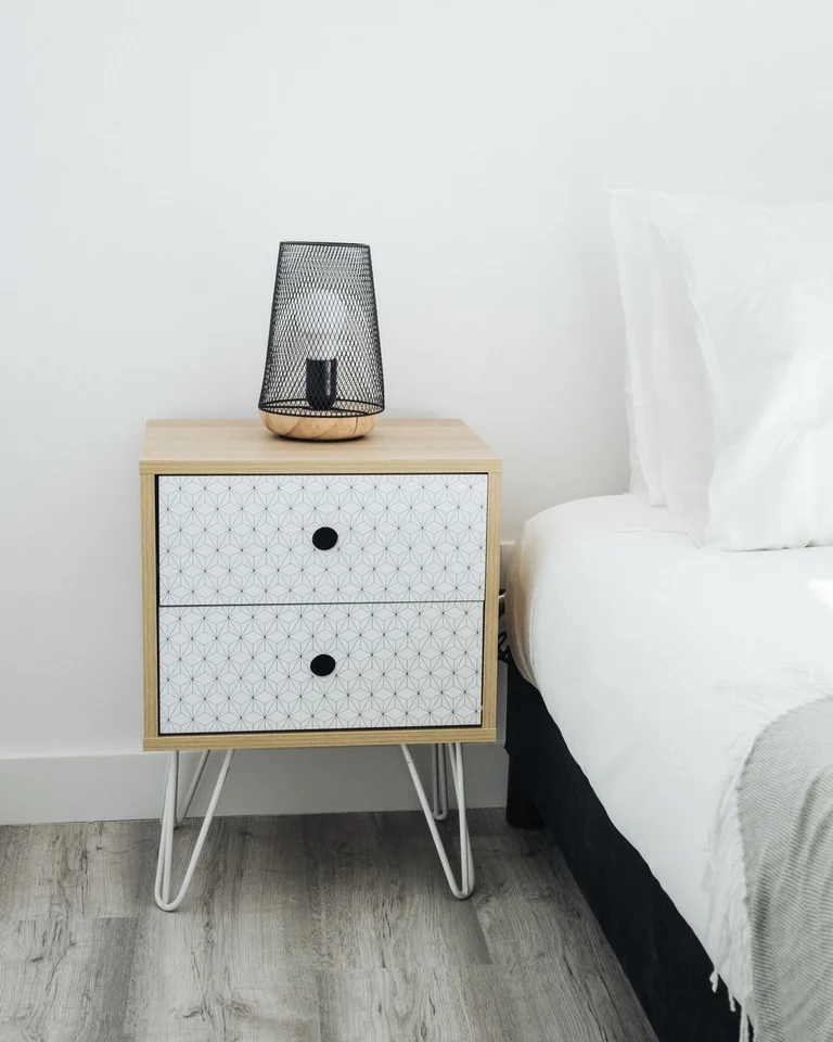
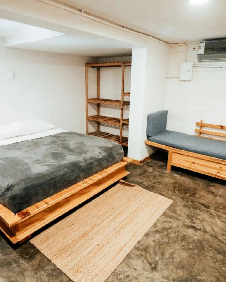
Materials are the quiet glue of a cohesive room. Pick one wood tone — light oak, warm walnut, or pale ash — and one metal finish — black, brass, or brushed nickel — and repeat both in every zone. The bed frame, the coffee table legs, the desk, and the shelving do not need to match as a set, but they should share the same wood family and the same metal. When each zone introduces its own wood and its own metal, the room fragments, even if the colors match. This rule also simplifies shopping: if a piece does not fit the wood and metal you already own, it does not come home, no matter how good it looks alone. Photograph your existing pieces before you shop so you can compare tones honestly instead of guessing under store lighting.
4. Give Every Zone Its Own Switchable Light Layer
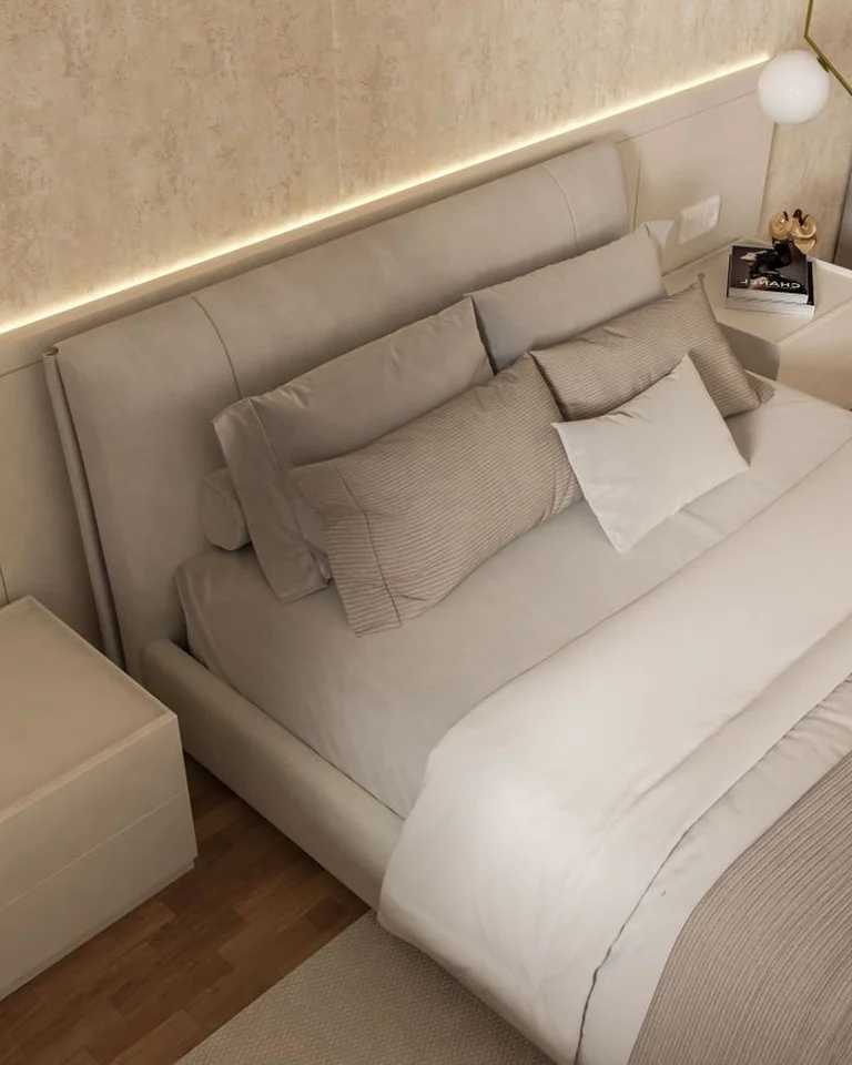
One ceiling light makes a studio feel like a dorm room. Designed rooms give each zone its own light you can switch separately: a bedside lamp or wall light for sleep, a floor lamp for lounging, and a task light for work. When only the bedside lamp is on, the room reads as a bedroom; when only the floor lamp is on, it reads as a living room. That switchable identity is exactly what makes a one-room home feel like several rooms. Use warm bulbs (around 2700K) in the sleep and lounge zones, and keep the work light slightly brighter and cooler so your brain gets a clear “work mode” signal. Dimmer plugs are a cheap, renter-friendly way to add this control without touching the wiring.
5. Use Two Rugs With a Strip of Bare Floor Between Them
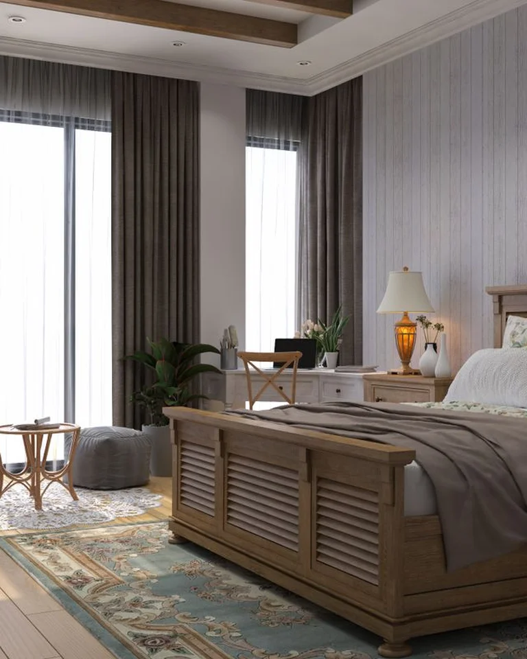
Rugs are the easiest walls a studio can have, but one giant rug under everything erases the zones you are trying to create. Instead, put one rug under the bed area and a different rug under the seating area, and leave a strip of bare floor between them. That strip acts like a doorway: your eye registers “bedroom ends here, living room starts there” without any furniture blocking the way. Size matters — each rug should sit under at least the front legs of its zone’s furniture, or the zone will look like it is floating. Keep the two rugs in the same color family but different textures or patterns, so the zones read as related rooms, not competing ones. This is also the cheapest way to test a layout before committing to heavier dividers.
6. Step Furniture Heights Down Toward the Window
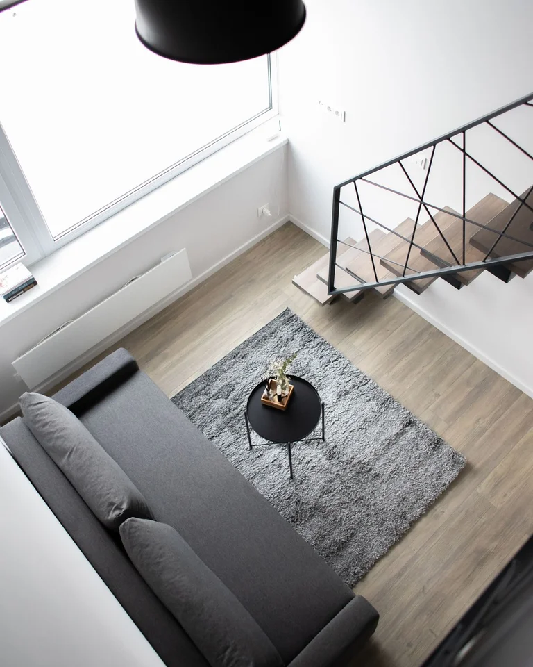
Sightlines decide whether a studio feels open or chopped up. Put the tallest pieces — wardrobes, tall shelves — against solid walls, and keep furniture low near windows and along the main walking path. When heights step down toward the light, your eye travels across the whole room instead of stopping at a tall block, and the room feels larger than its floor plan. This is why a low platform bed and a low sofa usually suit studios better than a tall sleigh bed and a high-back sofa, even in the same square footage. Measure the sightline from your front door: if the first thing you see is the back of a tall wardrobe, move it. The first view into the room should be the composed bed wall or the lounge zone, not a wall of furniture.
7. Let Texture Do the Zoning
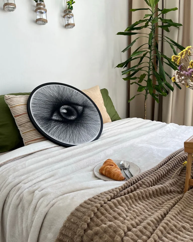
When colors and materials already match, texture is what keeps zones from looking flat. Give the sleep zone soft, sink-in textures — washed linen, a chunky knit throw, a plush rug underfoot. Give the lounge zone slightly firmer, more structured textures — a tight-weave sofa fabric, a flat-weave rug, a leather or wood tray. Give the work zone smooth, easy-clean surfaces. Your hands and feet then confirm what your eyes already suspect: this corner is for rest, that corner is for sitting up and getting things done. Texture zoning works especially well in rentals where paint and construction are off the table, because every bit of it arrives as bedding, throws, and rugs you can take with you when you move.
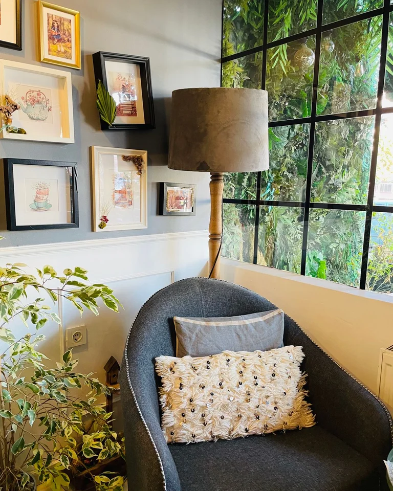
8. Give Each Zone Its Own Art Mood, Not One Gallery Wall
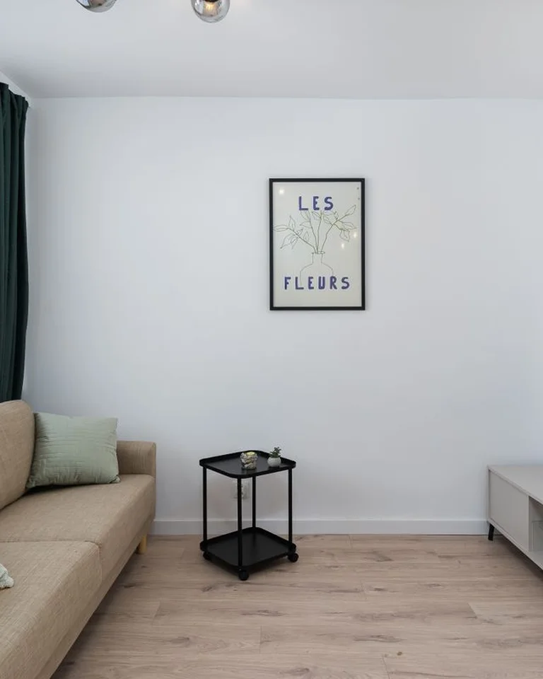
One big gallery wall spread across a studio blurs the zones it crosses. Instead, give each zone its own art mood: one calm, simple piece above the bed — something you would happily wake up to — and a bolder, more social piece in the lounge zone. Hang each piece centered on its own zone’s furniture, not centered on the shared wall. This “art belongs to a zone” rule quietly labels the room without a single divider, and it stops the common mistake of centering art between two zones so it belongs to neither. If you love gallery walls, keep the cluster inside one zone — above the sofa, for example — and leave the sleep zone’s wall deliberately quiet. A quiet bed wall is part of what makes the sleep zone feel restful.
9. Create a Night Mode With One Curtain Pull and Dimmed Lights
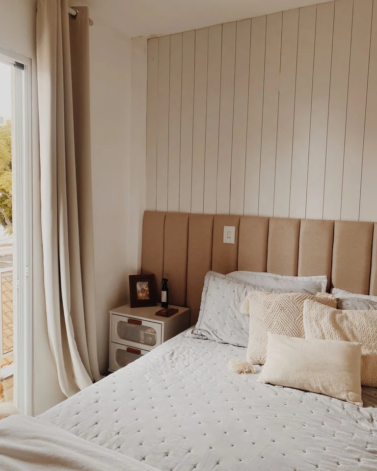
A designed studio changes character at night. Build a simple “night mode”: a ceiling-track or tension-rod curtain you can draw around the bed, the bedside lamp on low, and the lounge and work lights off. One pull of the curtain plus one dimmer switch turns the open room into a private sleep space, and reversing it in the morning returns the room to daytime use. The ritual matters as much as the look — it trains your brain to associate the curtained, dimly lit bed with sleep, even though the desk is a few steps away. If a curtain track is not possible, a tall open shelf or a folding screen plus the same lighting change gives you most of the same effect. For more on carving out a calm corner to unwind, see these cozy reading nook ideas — the same low-light, soft-texture logic applies.
10. Do a Ten-Minute Weekly Edit So the Design Stays Visible
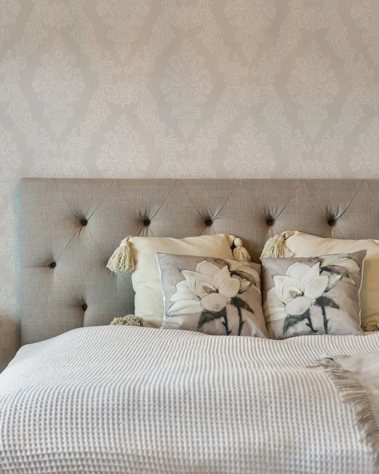
The most designed studios are edited studios. Once a week, spend ten minutes returning every surface to its plan: clear the bedside surface to lamp plus book, clear the desk to work essentials, fold the throw, and put anything without a zone into its home or out of the room. Clutter is the fastest way to undo zones, because stray objects blur boundaries that rugs and lighting worked hard to create. This is not about minimalism for its own sake — it is maintenance for the design you already built. A studio that gets a weekly edit keeps looking intentional month after month, while the same room without it drifts back to looking decorated: nice things, no plan. Small rooms punish drift quickly, so a short weekly reset beats a rare deep clean; the same is true of tiny bedrooms and narrow bedrooms, where every stray item shows.
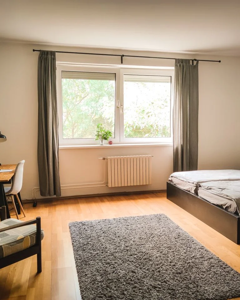
Start with the palette and the bed wall this weekend — those two decisions set the rules everything else follows. Then add one light layer per zone, lay the two rugs, and give each zone its art mood. If you are working with low ceilings as well, these low-ceiling bedroom ideas pair well with the height-stepping rule above. A studio bedroom does not need more space or more decor to feel designed. It needs a plan that repeats: same colors, same materials, same lighting logic, in every zone, every day.
Frequently Asked Questions
How do you zone a studio apartment layout without walls?
Use rugs, furniture direction, and lighting together rather than relying on any one trick. One rug per zone, furniture turned to face its own zone (for example, a sofa with its back to the bed), and a separate lamp in each zone create boundaries your eye reads as rooms — no construction needed. Two or three of these tools combined beat any single divider.
Where should the bed go in a studio apartment layout?
Put the bed against the longest unbroken wall farthest from the entry door, out of the direct sightline when you walk in. That single decision does more to make a studio feel intentional than any decoration, because guests see the living zone first and the sleep zone reads as a deliberate, private corner rather than the first thing in the room.
How much walkway space do you need in a studio apartment layout?
Keep primary walkways 30 to 36 inches wide and secondary paths no narrower than 24 inches. Going below those widths anywhere makes the whole space feel tight, even with open floor area elsewhere — so protect the path from the door to the kitchen and bathroom before placing any large furniture.
Can renters use these studio apartment layout ideas without losing their deposit?
Yes. Every idea in this article is reversible: rugs, freestanding shelves, tension-rod or adhesive-mount curtain tracks, plug-in wall lights, and dimmer plugs all create zoning without drilling into walls or ceilings, so your security deposit stays intact. Check your lease for curtain-track rules before mounting anything overhead.
What role do rugs play in zoning a studio apartment?
Rugs act as visual ground markers. A rug under the sofa and coffee table defines the living area, while a different rug under or beside the bed marks the sleep zone. Choosing distinct rugs in the same color family helps your eye see separate zones, and the strip of bare floor between them reads like a doorway between two rooms.
Conclusion
A studio bedroom looks designed when its zones share one palette, one set of materials, and one lighting plan — and when a weekly edit keeps those choices visible. Start with color and the bed wall, add light and rugs zone by zone, and let texture and art finish the job. The room will still be one room, but it will read, feel, and function like a home with rooms.